Interview w/ Steve Pikelny: Maps of Nothing
Minting will unpause for Maps of Nothing on artblock.io, 6/13/2022 @ 12:00 EDT
Steve Pikelny, is a Brooklyn-based software engineer and multimedia artist who is quickly becoming one of the hottest artists in the NFT scene. In our most recent conversation we talked about his upcoming project: Maps of Nothing
CryptoGateway: Steve, thank you once again for joining me to talk about your newest project, Maps of Nothing.
Steve Pikelny: Of course, thank you once again for having me.
CG: Let's get right into it. This is an amazingly versatile and visually stunning project. I was completely transfixed scrolling through the test collection you sent me. And while it definitely has a certain steviep flair that I can't quite put my finger on, I'll be honest -- This wasn't quite what I was expecting your next big project to be. So I just have to ask: why maps?
SP: You know, I want to keep everyone on their toes.
CG: Haha, clearly!
SP: Honestly, the reason is quite simple. When I started seriously exploring generative art, specifically the so-called "long-form" genre that Art Blocks specializes in, I asked myself what projects I could work on that were both conceptually rich and visually striking. And I came up with two answers: money and maps. The money was higher priority, so that came first. But once Fake Internet Money was wrapped up I started thinking about what a generative map project could look like.
CG: What do you find so visually appealing about maps?
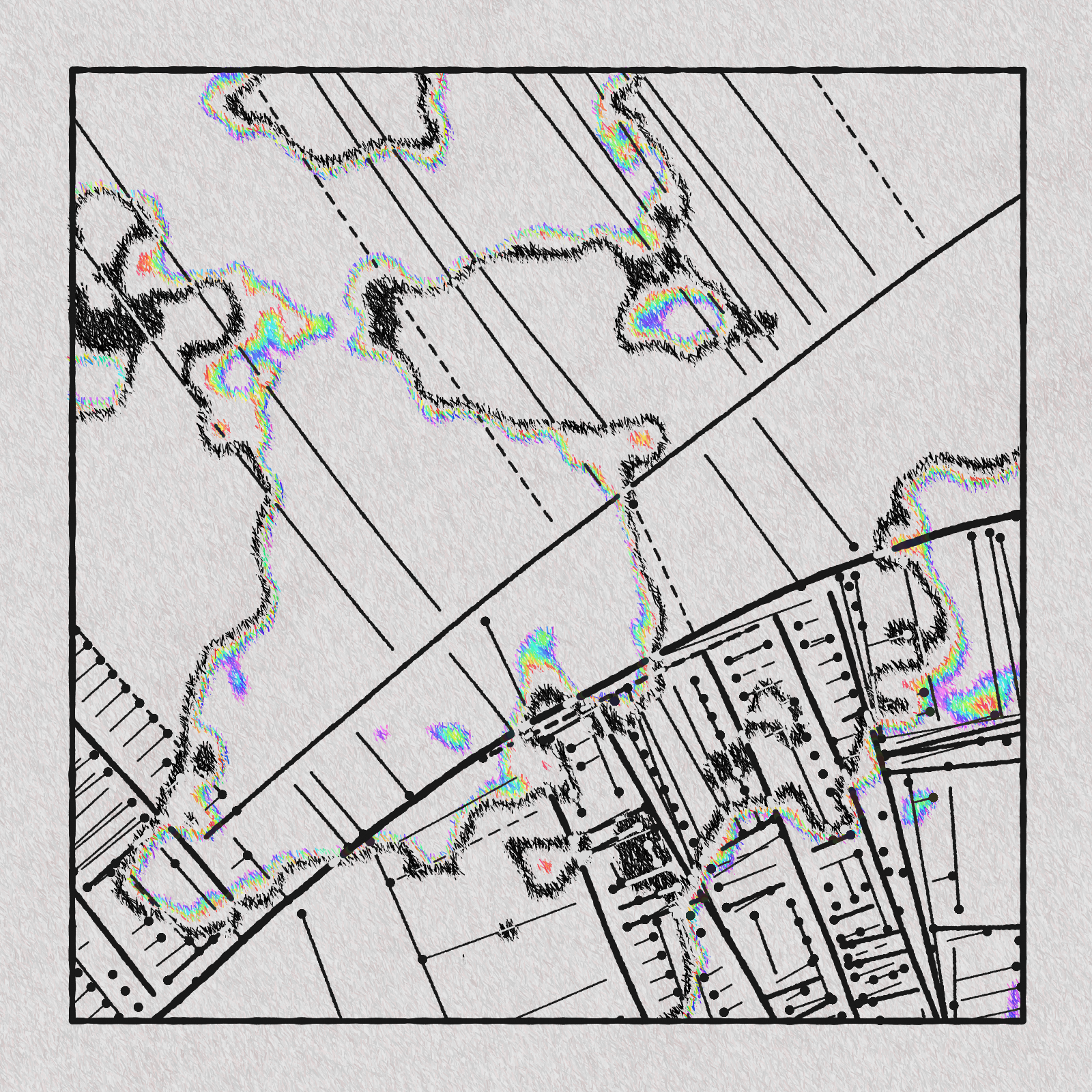
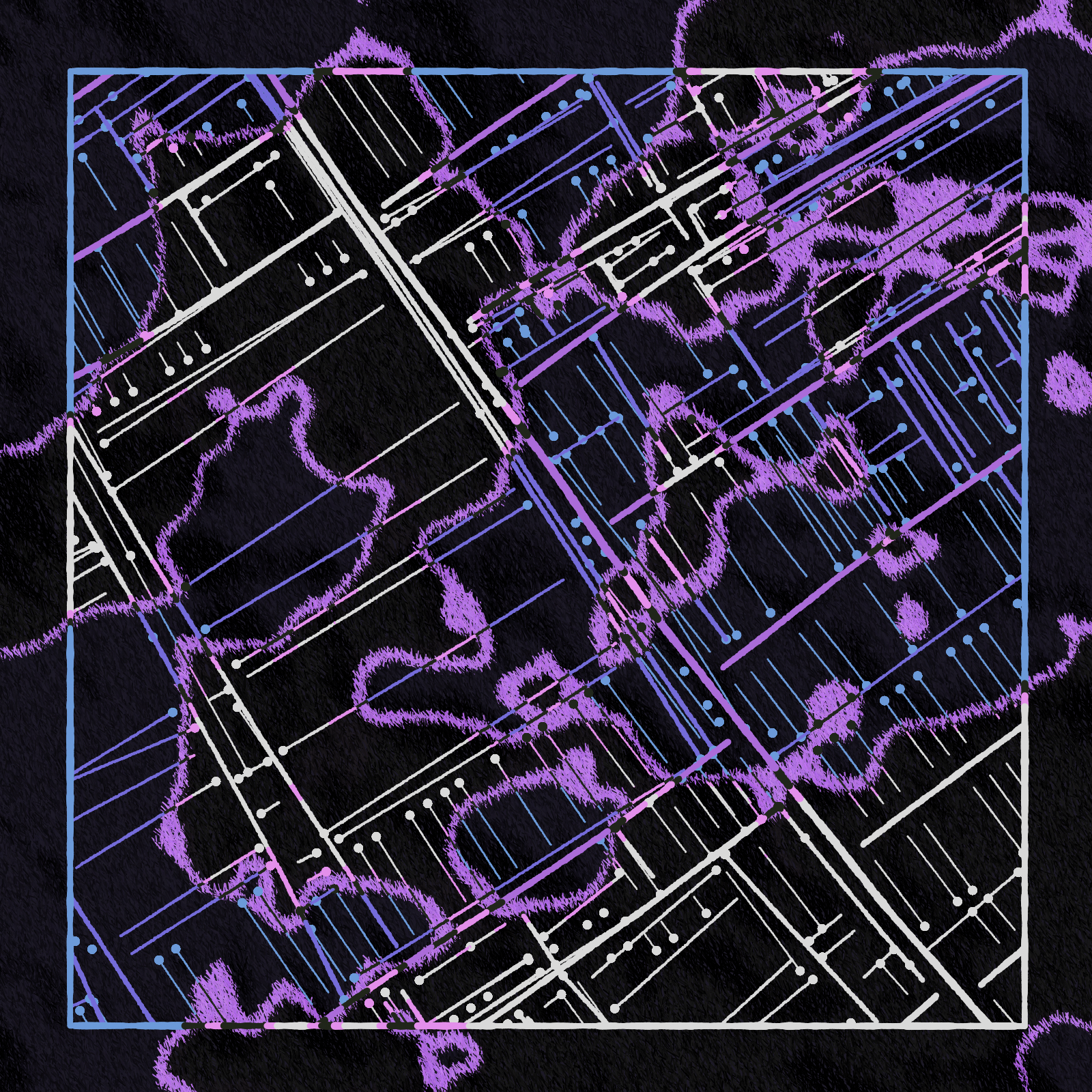
SP: I'm not sure. I think it's just one of those things where, from a purely visual standpoint, it's an incredibly detailed pattern that doesn't always have an obvious order to it. If you cut a splotch out from a map and used some machine learning model to predict and redraw the missing segment, you probably couldn't do it in a lot of cases. But at the same time, maps aren't total chaos. There's still a logic and a flow to them, and I think your brain picks up on that even if it can't quite predict it. And I think that tension is really interesting.
And of course, the reason for all of this is that maps are an abstract representation of something else. If we're talking about street maps, for example, then the grid is really a function of geography and social happenstance. So looking at a map of Brooklyn, for example, there are plenty of places where the street grid makes total sense... but then it randomly morphes into a completely different grid. Why is that? Well, sometimes it's an artifact of two towns that grew into each other 200 years ago. Sometimes the topography shifts and a different logic makes sense. And those are things that you're not really going to pick up on from just looking at visual patterns.
CG: As the french philosophers like to say, the map is not the territory.
SP: Exactly. And I think that starts to get into why this is such a conceptually rich territory. Maps, along with money, are both these amazing tools of abstraction. But it's interesting how they work in opposite directions. On one hand, money is sort of a reification -- there's a $2 word I learned recently -- of the idea of "value". We take this very abstract idea, and we create a concrete stand in for it. On the other hand, maps are a totally abstracted representation of a physical space.
CG: Right, and I think what's really funny about your last two Art Blocks projects is that you've created the abstraction (or reification) without their counterparts.
SP: You took the words right out of my mouth. So that's why I think the names *Fake* Internet Money, and Maps of *Nothing* are so important to the concepts behind the projects.
CG: They're both such good names, and they really made things click for me. The pseudo-legal disclaimers are also great. It really elevated FIM, especially. It feels like a little less obvious of a choice with the maps though.
SP: Yeah, that's a fair point. It wasn't obvious to me either, to be honest. But I chose to do it for a few reasons. First, it draws a clearer through line between these two projects, which I think helps tease out some of those themes we were just talking about. Second, I think it's a really good way to highlight certain elements of the project without highlighting them. So for example, instead of saying "hey everyone, did you notice how the splotches sort of look like topography sometimes?", you can say "whatever you do, don't interpret the splotches as topography". And this immediately puts the idea in the head of the viewer without telling them that it *should* look a certain way. It lets them come to their own conclusion, even if you're guiding them. Third, I think this also creates an interesting context in which to view the project. Like, by saying the maps have "no guarantee of accuracy or completeness, and are provided without any warranty whatsoever, either express or implied.", it sort of creates the impression that someone could actually mistake these for real maps, and purchase them with that intention.
CG: It makes me wonder, who the hell are these people buying these maps expecting it to accurately depict reality?
SP: Hey, my lawyers are really strict about these things and I'm just trying to cover all of my bases.
CG: That's true. You don't want a bunch of apes thinking that they have a claim to some steviep-created metaverse land.
SP: Seriously though, at the end of the day I also think it's important to remind people that this is an artwork that they're buying, and that they shouldn't necessarily expect utility or a monetary profit from them. And ultimately, while I think the FIM disclaimer frames that project as "not an investment", the Maps disclaimer frames it as "not a product".
CG: I'd like to dive into some of the ways that you're visually exploring these themes.
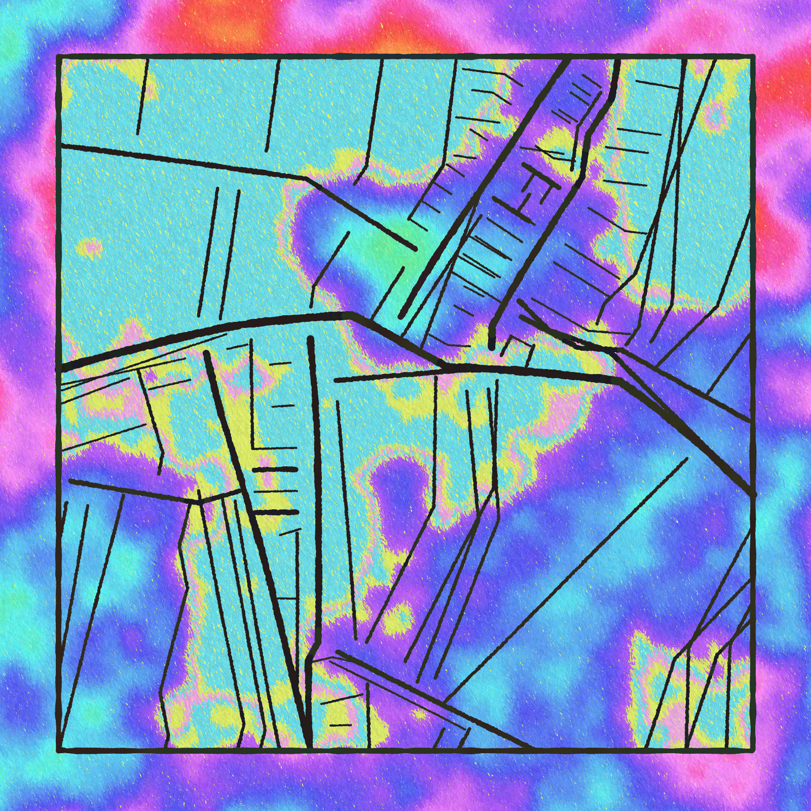
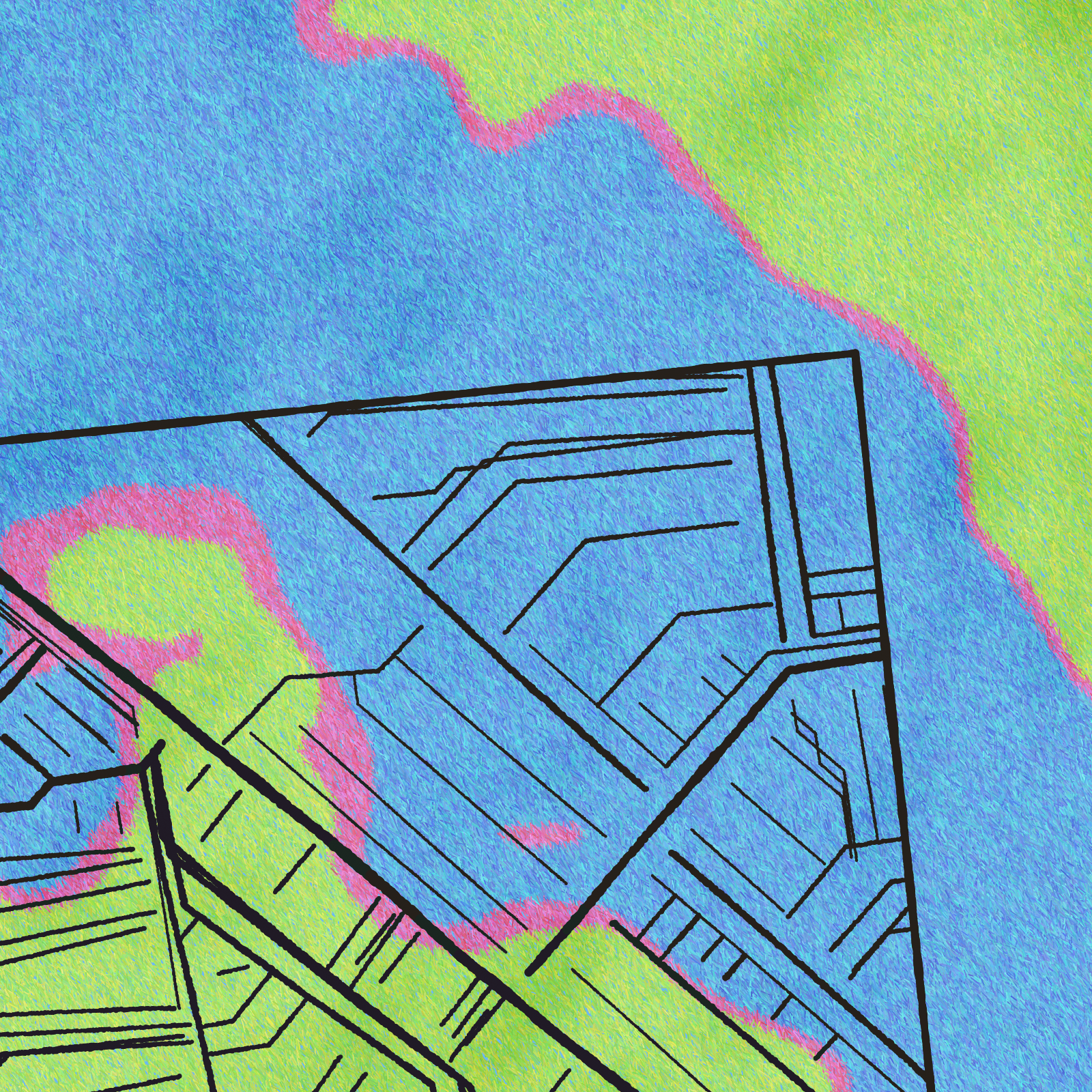
SP: Sure. I think it sort of boils down to the idea that these are simulations of paper maps -- each piece is faking the abstraction as well as the material that the abstraction is presented on. So all of the interesting visuals come out of the interplay between what reads as part of the "platonic" map being represented, and what reads as an artifact of the printing process representing that map. The splotches are probably the best example, where it's never entirely obvious what they're supposed to be. Sometimes they look like they're aspects of the geography that a city grid is built on top of. Sometimes they look like they're supposed to be crime heat maps. Sometimes they just look like someone spilled coffee on the map. Some of my favorite outputs are the ones where the splotches either fade out or extend beyond the border of the drawn map. It can create a weird effect where they start out feeling like they're part of the "platonic" map, and end up as part of the printed map. The shadows are another example. Sometimes they look like they're cast by mountains, and other times they look like they're cast by paper crumples.
CG: And adding to that, another through line between this project and Fake Internet Money is the inclusion of obvious misprints. And again, this is very funny because you have these very analogue errors injected into this thing that's supposed to be digitally rendered. Like, there's no reason for a map to be drastically printed off center, or to be printed with low ink. It adds an appreciated level of absurdity to it. And this, combined with the project description really makes me wonder about the origin story of some of these maps. Like, what was the context in which this map was printed in such a fucked up way? Who's out there preparing a lawsuit against you because one of your maps failed to help them navigate their way to a dentist appointment?
SP: We'll leave that as an exercise to the viewer.
CG: Steve, thank you for joining me once again. It's always a pleasure, and I look forward to our next conversation.
SP: The pleasure is all mine.